Campaign Photography Unit
What Is Campaign Photography?
A campaign photographer creates and takes an image to have an influential impact on the audience. This may be so they donate, raise money or take part in charity events. They get their main point across through short sentences or captions and a variety of imagery. It’s generally made in a well planned and organised manor, with a target in mind.


My Favourite Campaign Photography

|
I like the way this image shows a gun with cigarettes representing the bullets. As these two things kill people, its representing how a gun and a cigarette is related in which you could die through using either of these two things. Smoking is just like pulling the trigger on a gun as it can kill you. The background is white to make the focus the gun and cigarettes, it is slightly over exposed to bring out the whiteness of the lights reflection on the gun and the cigarette further more I also like the composition the image is took from as it creates leading lines meaning your eyes naturally go to the cigarettes.
|

|
This is a strong and powerful image because it represents a person who is being sold (slavery). The models eyes are glistening making the person focus on this, this makes the feel a strong, but negative emotion which is good for a campaign because that’s the whole point-getting the audience involved and making them ask their own questions in order for them to help. This is also a very powerful image and really engages with the emotions of its audience, this effect is accomplished by the colour scheme. Black and white is the representation of dark, sadistic and depressing, these feelings all link to slavery.
|


|
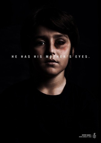
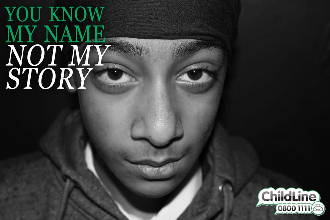
I like this image as it strongly suggests what it is about.This image is made using a black background and soft lighting to create a dramatic depressing atmosphere. I like the way the photographer used dim lighting on the right side of his face to create shadow along the main facial features, the black top and background combined to create the effect of loneliness. Loneliness symbolizes the feeling of people going through domestic abuse themselves. The caption saying "He has his mother’s eyes" is placed over the image, this implies that his mother is going through the same thing. I think this is used to create the sense of emotion and helplessness towards women, making them think in more depth of what may be happening in her relationship/ life and if they are a victim. I think this image is to show women who are suffering from domestic abuse to think of how it could be affecting their children physically as well as mentally. In the bottom right there is also a website, this website leads to an international organisation website where they have a series of different problems and some solutions for them.
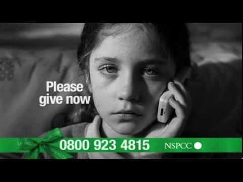
I like this image because it has an emotional effect on the audience. The image is showing a young girl who is not happy at home, it is unclear of what is making her sad, this is because there are many different problems other children go through therefore it is appealing to a wider audience. Placing the eyes along the top cross section in the rule of thirds makes the image more interesting. Also the photographer uses a shallow depth to make the girl the only focus, there is also shadow along the right side of the girls face and from my own knowledge I know for this you need to introduce light to one side of the face. this also emphasizes the phone showing she is contacting the organisation. As the only bold colour in the photograph is the text this diverts the audience the attention to look at this, therefore they see the number and the organisations name that can be contacted.
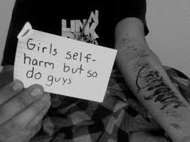
I like this image as it has a very powerful message given across the the audience. This is due to me having a clear idea to what it’s about: the photographer is trying to spread the awareness of self-harm within boys as it is thought that only girls do it. There is a sad mood set over this piece as I can tell this due to the photograph being black and white, they have created a good composition by using multi focus points (the cuts and paper) and representing them at different depths on the image, to me it looks like the photographer has enhanced the paper to make it stand out. |
My Campaign Photography.
In my first shoot I want to try make a self-harm awareness poster, I am going to make some fake blood out of red and black paint with a tea spoon of water and put it onto my models arm acting like cuts as I want to make the cuts look deep I will make the blood have a droplet effect. To make sure my image is sharp I will put it onto 1/700th of a second taking into accountancy it is a really dull day.
First shoot.


On this shot I set my camera at a fast shutter speed as the blood was dripping so it was sharp. I also set it onto a small depth of field so the arm was in focus.
Best.
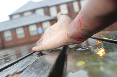
This is my best photograph because the focus point and depth of field makes the arm become the point of focus to the audience; I also like the reflection of the rain water on the bench this just adds more to the image. Despite this being my best image personally I don’t think this is the best I can do because the models arm looks unnatural, the main part (blood) seems not to be the point of focus like id wished it to be. I also used a good shutter speed and my exposure was how I wanted it.
Worst.

This is my worst photograph because it is extremely underexposed and is very unclear. I also did not add a focus point which would make the audience confused on what there actually looking at. it also does not have a depth a filed, which I changed to improve my image.
Second Shoot.
To make the next shot look abit more realistic we used a pva glue stick to make thiner marks, we also added abit of black paint to make the paint have similar characteristics of blood.


Best.
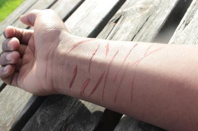
I do like this image or at least the thinking behind it I like the way the sun and the shadows work together however to improve this in my next shoot, I am going to take the photograph at a different angle to make the cuts seem more realistic I’m also going to make the paint runny to also accomplice this.
Worst.
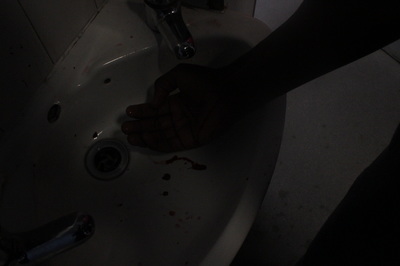
This photograph not alone took from a not so good angle it is was also underexposed. This image does not draw the audience in meaning this is not a good campaign poster. To improve this image I would have to set a higher shutter speed and make sure the exposure is set at zero.
Overall Comparison.
|

|
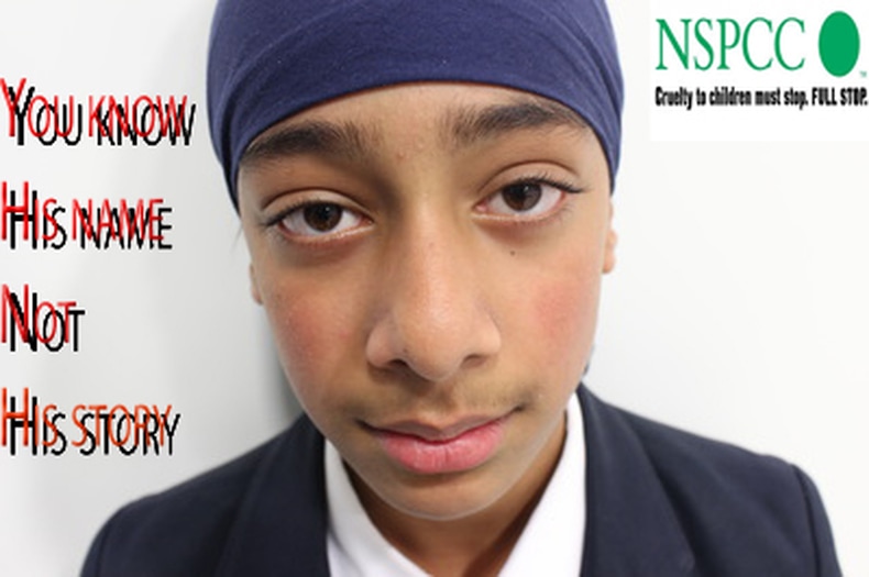
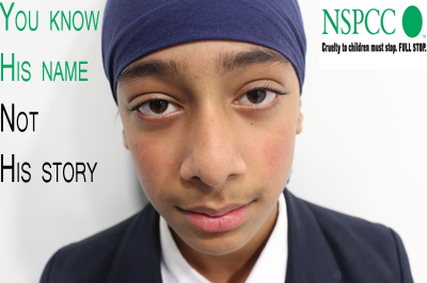
From my research I realised I have to include the features of a campaign in order to be able to easily , so In my campaign I chose to do the cuts.in comparison to the real campaign in relation to mine it has more features for example the writing on the card and is black and white, therefore I have realised that I will need to do this to my image to improve it overall. I am going to recreate a plan further down and improve on top of this shoot.
Third Shoot.


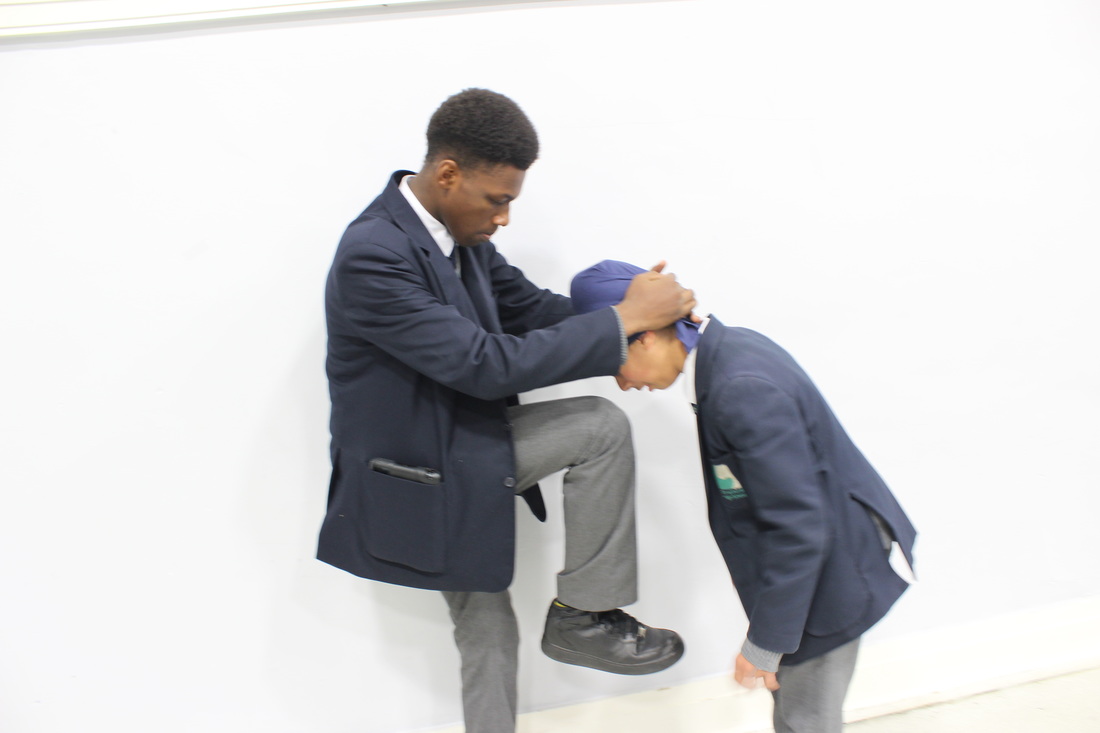


My plan was to make people aware of bullying, I have taken photographs of the two models to try and show one of them being bullied. I was going to edit the image by adding a photograph of a different scene into the models eye however, I was not happy with the photographs that I captured as I did not like the background and most of them were slightly out of focused. I have taken more photographs as I feel that this shoot was not successful.
Best.

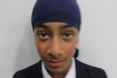
This is my favourite image because it has a powerful presence tried to get both horizontal and vertical intersections on the line, it didn’t work however if I was to further improve this and come back top this shoot I would alter that also like the way my model is against the white background we impacted the image also using a fluorescent light bulb and a light softener.
Worst.
I chose this as my worst image as the shutter speed was set low this meant my images were out of focus to fix this I made my shutter speed faster.
Further Editing Of Best Image.


When I put this photograph on the web site I realised that the font and colours did not really go together therefore I used the eye dropper tool to copy the colour From the NSPCC logo. I also copied the type of font as best as I could to make my image look better.

I have changed the colours but it still does not seem right, I am going to do a reshoot as my creation is lacking in meaning and does not have the same desired effect as the image below and my research.

From comparison I can clearly tell the similarities and differences I prefer the NSPCC’s real advert because of the colours I shows, the poster uses black and white colouring to create the dramatic effect of a really sad environment however the similarities between mine and NSPCC is that I have my models eyes on the top cross section on the rule of thirds and we both have used a very similar 'text' colour scheme, they used green as the only colour because green represents 'go', enforcing the feeling of the children needing to take action. From this I know to improve my image I need to create a more dark atmosphere what will help me add more visual meaning to my image.
Fourth Shoot.


On this image I used a medium depth of field to try blur the background out.
My best image.
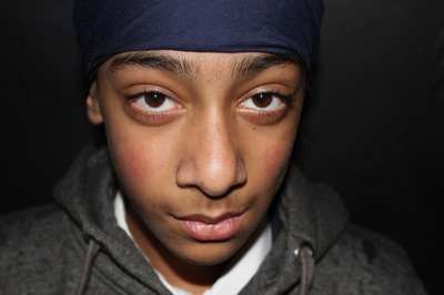
This image is my favourite because the eyes stand out and become the heart of the photograph, the eyes are the main focus point of the image. My use off shadows is more effective on this shot as it reflects the mood I am trying to give off (a dark depressing one). The black background reinforces that how a person’s being bullied and how also they can feel lonely and that they are in dark place.


Before I edited my image I turned it black and white
1-my first piece of editing I deleted the background layer of my NSPCC and childline logo
2, 3-int he next stages of editing I overlay my logos and added text
4-to refine my image I changed size, fonts and words spacing and deleted the NSPCC logo and moved things around until it had a professional look.
Finished Piece
This image is exactly how I wanted it, it still follows a colour scheme, the black and white gives of an impression of depression, sadness, I love this image mainly because my models eyes give of a very powerful effect.
Overall Comparison.
My first campaign poster came out as I planned however as I said in my evaluation it lacked in portraying the theme of the real NSPCC’s poster above therefor to refine this I came up with a plan, I decided to re edit my shoot and change the colour of the text to turn it green, this would help me show more link to the NSPCC poster.
|
With all my changes made I saw a clear improvement, however this set me to believe that I should be able to make some more small changes what will make a huge difference. I noticed the text did not stand out enough (also NSPCC logo) to draw a viewer in therefor I came up with a completely new shoot and I have also chosen to use a similar editing theme however I changed "his feelings" to "my feelings" to give a more dramatic feeling for my audience, I wiill changed the background in the shoot to black this really added to the dark mood I wanted to portray within the poster, I will also turn my image black and white.
|

I have now finished editing my photograph, I feel like my image portrays an overall realistic look and has more dramatic effect because of the shades I have used. I created a nice composition of the eyes and made them the focus point, I also chose to keep my writing green as this helps my image stand out and also is a mentally stimulating thing, as green means go. I think if I was to use this as a real campaign poster it would be successful in what the aim is.
|
Fifth Shoot.
What I'm going to do.
I'm planning on making a campaign poster what aims to make people more aware of self-harm within boys, I’m going to get a model, I’m going to make fake cuts on the inside of the boy's arm as this part of the body is known to be cut, I’m also going to get a piece of paper what says "it’s just as hard to be Ken than it is to be Barbie." this is showing that boys also are conscious about their appearance and stress over being perfect. I plan on the boy having the paper on a desk and having his arm showing with blood on the paper and looking like his blood had dripped on to it furthermore I am going to use Photoshop and filtering the black and white light, this will make the reader sense it’s not happy and also the colour represents depression stress and various other things, the white represents when you’re in a tunnel you can see a way out which is usually white light.
The preparation.


The preparation consisted on a steady arm to make self-harm like cuts we used a glue stick to make effect slice effect because if we used a paint brush it would look to smooth however cuts look sharp and we could only have this effect with the way we made it, the paint was an imitation of blood, I used a piece of paper and pen to write "it’s just as hard to be ken than it is to be Barbie". Instead of using a stencil I ended up going free-hand simply because the stencils looked too fancy in the shot.


My worst images.


These are my worst images because I got the wrong part in focus and both images were under exposed.
My best images.
|
I like these selection of images because it looks like one of the images is in the models P.O.V and the other one is a picture of him looking the same way the P.O.V one was looking. These are 2 perspectives of the model looking at the message on the paper. I also like the veins because it gives more detail to the picture, veins usually expand when flooded with adrenaline and this is what was happening in this image.
|

From my research this is the image I tried to recreate
I tried to recreate this as I like the effect the image gave of to me, overall I actually prefer my image because I prefer mine has colour, and to me it gives more of a symbolisation things can change however this is how I see it and is my personal opinion. |


Second Campaign-Box.
How i will do it.
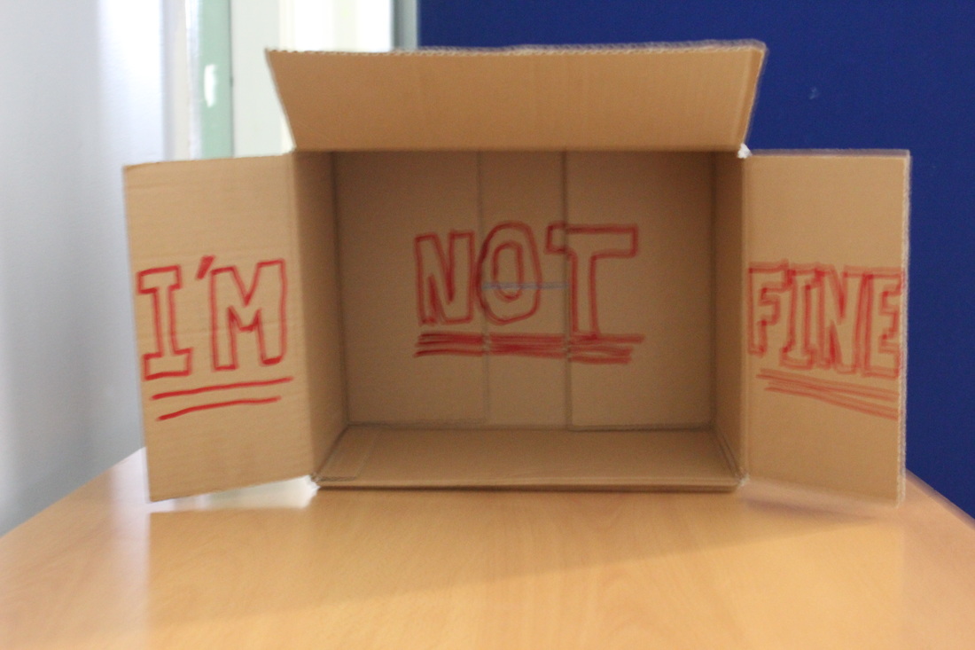
I will use a plain cardboard box and a marker pen On the left side of the open lap I will put I’m then in the bottom of the box I’m going to put “not” and on the right flap I’m going to put” fine”. I want to surround the image with emptiness to give off a lonely mood . I’m going to show this by it visually saying “I’m not fine”, this is shown in my plans.

|
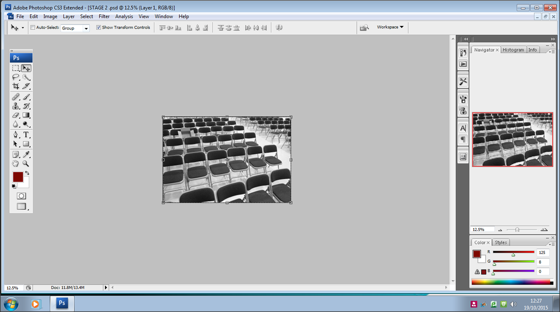
How i made this image.To make this image I used publisher and I drew lines to make a 3d perspective cardboard box.
|
What the message is.
The message in my creation will be to look in all perspectives and not Judge a "book by its cover" or in this case "The box by the contents" and this translates to a human as "are they fine…deeply”. By this this catches the audience’s attention for longer and to get them thinking and asking them selves questions. This is key to a successful campaign.
The Shots.


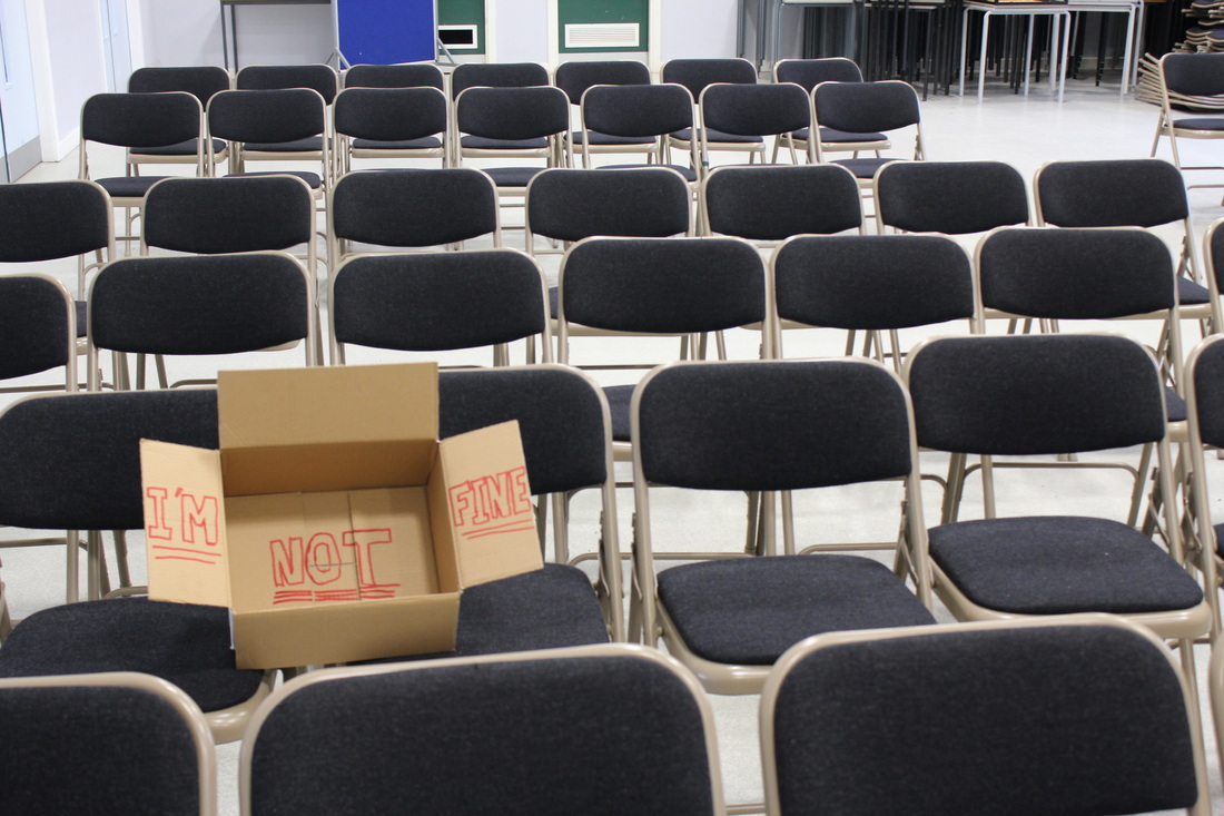


My best shot.
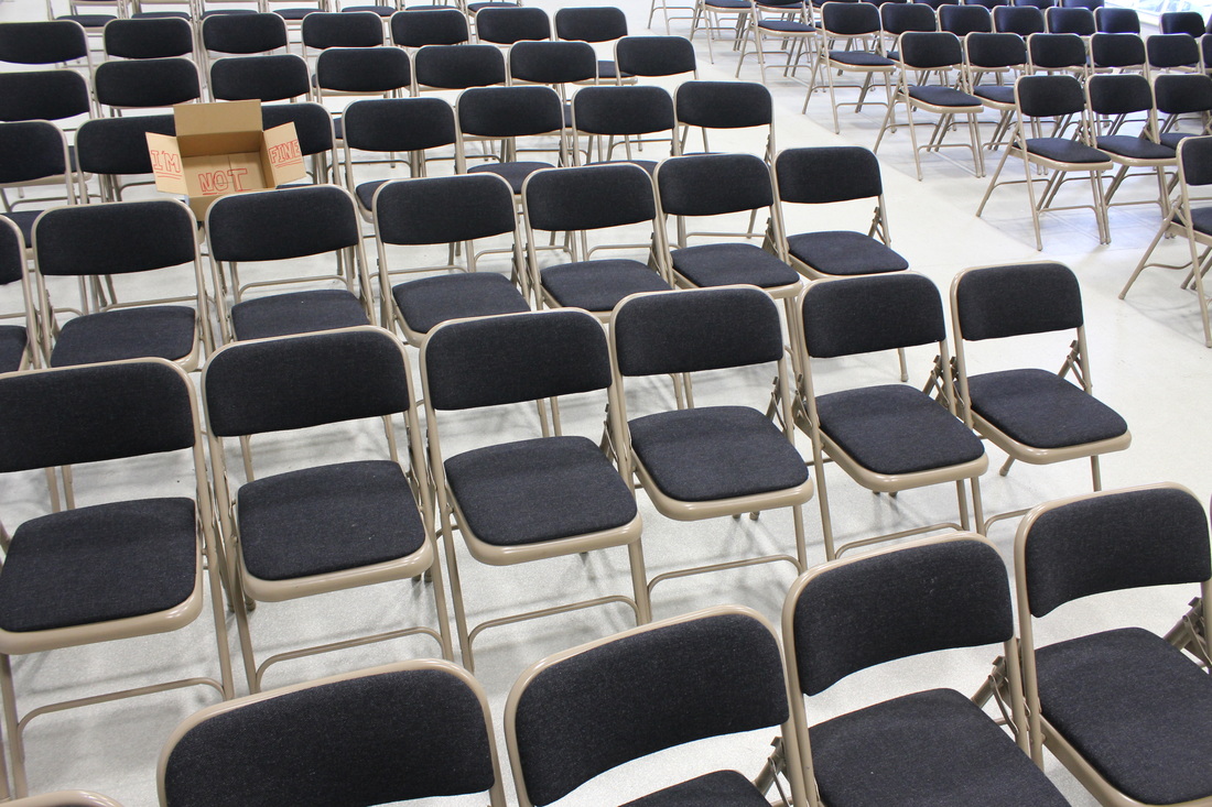
I like this shot because the empty spaces represent loneliness, and doing it on your own, I gave this effect by keeping the box mainly in focus however the other seats ever so blurred, I also used Photoshop to crop the back ground out because it looked untidy. Exposure is perfect; the box is on the horizontal line in rule of thirds.
Editing.
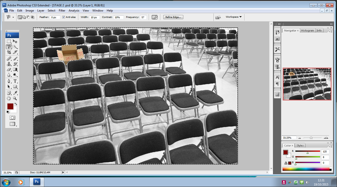
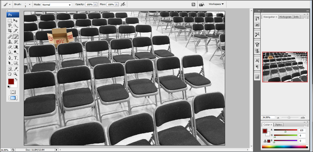
I decided to change the background to black and white but I kept the box it's original colour so it would stand out.
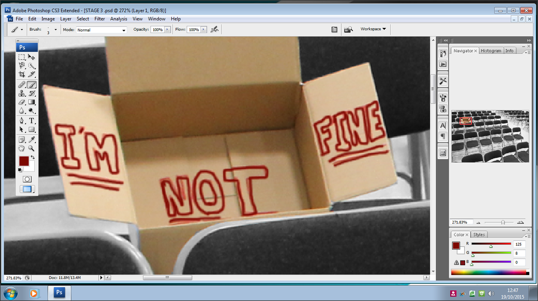
To make the writing stand out I used the brush tool on Photoshop to trace around the original letters I had drawn on. I used a darker red to make it stand out more, I used brush size 3 to thicken the lines.
Completed Piece.
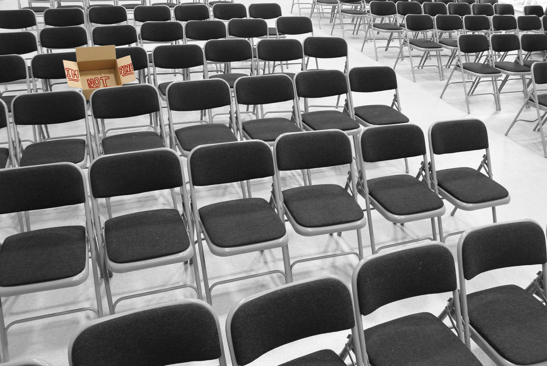
I chose to shoot my image like this because the box now also represents the loneliness that a person "who's not fine" would feel. The reason I created the box this way was so that when looked at from one angle it represents somebody saying "I'm fine" however the deeper you look into the box (the box represents the person's emotions) it shows how they really feel. When editing my picture I decided to make everything but the box black and white, this was because dark colours represent depression, anxiety and sadness. When taking this photograph my focus point was on the box so it stood out, I also used a medium depth of field F14 to make the front of my image slightly blurred (only slightly so you could still make out the seats).
Sixth shoot.


Editing.


image 1-in this image you can see me selecting the eye, I used the hue section tool to turn the brightness to 0 making the selected part black.
image 2, 3, 4, 5-in these images you can see me using the other images i took and crop the parts out I dont want.
image 5-in this image you can clearly see how some of the images are layered.
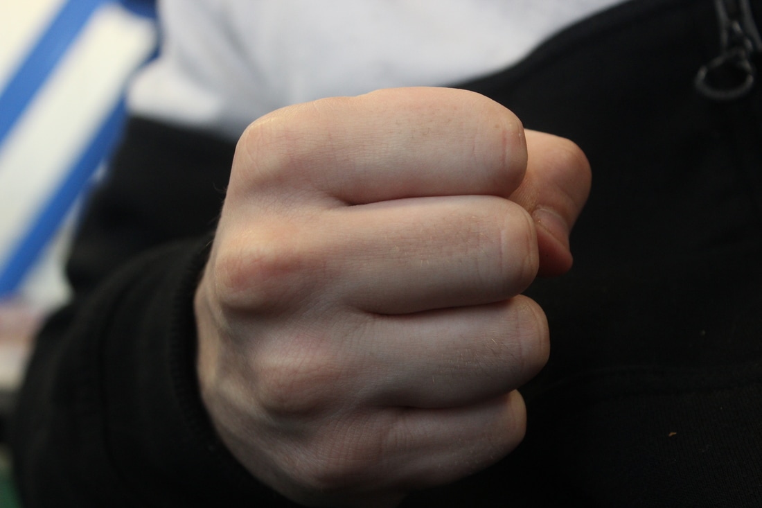
image 6-showing the placement of the arms
image 2, 3, 4, 5-in these images you can see me using the other images i took and crop the parts out I dont want.
image 5-in this image you can clearly see how some of the images are layered.
image 6-showing the placement of the arms

I think this image is effective for campaign photography as it clearly shows what it means, the arms going diagonal are shown to be like prison bars also to suggest the fact that it holding a person is there is also 2 hands holding on to the 'bars'. This suggests to the audience that this person is trapped in their own emotions, to furthermore develop my image I will being adding ‘a good Samaritans’ helpline and changing it black and white to enforce the fact of darkness within the persons feelings.
Small changes.
To develop my image further I will be editing a good Samaritan logo onto the image, this will give it more of a meaning as it is showing the targeted audience where they can find the help they need.
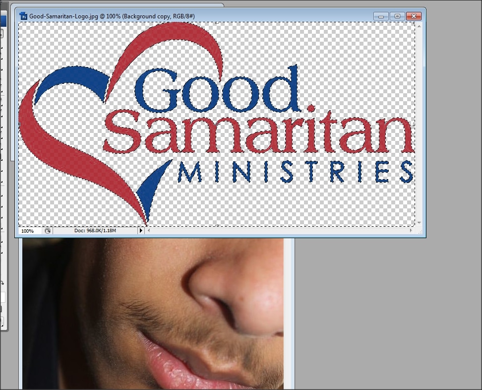
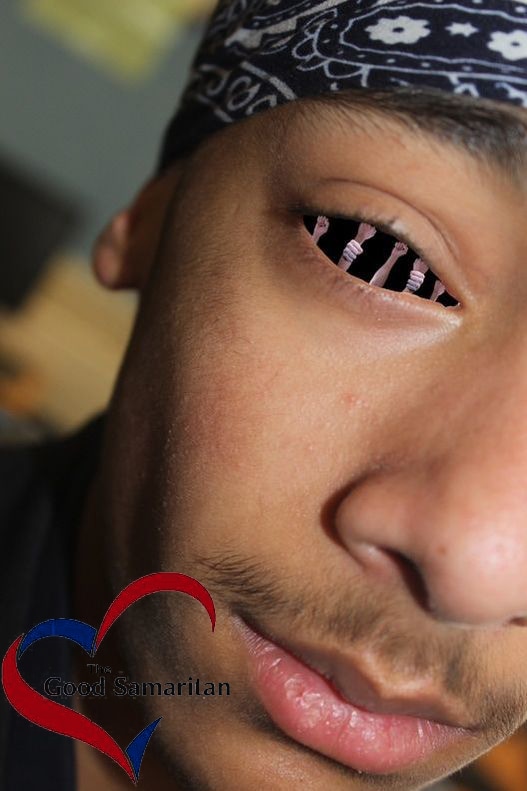
As you can see the Good Samaritan logo helps emphasis what my campaign poster is about
My idea for my next shoot.
This time I’m going to use a similar approach with using a box to send an image, its going to be a model holding, walking with a group of friends with a box - The box in colour and the rest black and with the focus set on the box, also I’m going to use the monochrome camera setting.
To do this I’m going to need:
-3-4 people.
-a cardboard box.
Editing.
For editing I’m going to add a Childline logo.
I'm going to add a black border what fades into the image.
To do this I’m going to need:
-3-4 people.
-a cardboard box.
Editing.
For editing I’m going to add a Childline logo.
I'm going to add a black border what fades into the image.
Evaluation.
This was definitely one of my favourite units as I came up with a good variety of plans, I also developed quite a few ideas to not only improve my images but the ideas within them, I also learnt how to use a few more tools on Photoshop such as text, paint, I also applied logos onto my own image to make it more realistic further more I also have had an insight to many things about my environment, this is because I looked through a lot of stats and data on many different things from racial abuse to how many religions are in the U.K
My Best Images.


