Architecture Photography.
Unit 2 Exam.
Architecture - Architecture just means the complexity or how carefully a structure of something is made. Architecture is based on structures/buildings we take for granted and don’t appreciate as much as we should. Architecture was at first formed whilst building religious monuments and shelters, they were deemed architecture if the made structures were very durable, aesthetically pleasing and served a purpose. Personally my favorite structure would have to be the majestic Taj Mahal in India this is because it has a lovely smooth design and it has many arches and circles, this gives it a soft, gentle like look making it more attractive.It is also is made of white ivory marble what gives it a sensational heavenly look. (Image below is not my own.)

Before this page starts I would like to inform you that you have to click onto the gallery of images to show the whole picture as weebly crops them into a squares, many thanks Kieran.
David Gutierrez
David Gutierrez is a self-taught London based photographer who specialises in architecture.David captures modern urbanscapes and turns them into contemporary, artful images he does this as he is interested in how the modern structures in the city impact a city's atmosphere and the relationships man can form with a building.On his website. He also has many different sub-genres of architectural images on his page such as twilight, exposure, imitation, structure, vertical and much more.
'Vertical'


One of David's sub-genres is vertical this is where he stands at the bottom of a structure and takes an image this is also known as a 'worm's eye view'. To capture these images David would have set the camera with a large f-stop this is so he is able to keep everything in focus, therefore, adding emphasis to the grandness of the structure/building. He would also use a low ISO to make sure his images did not come out grainy but instead crisp and clear. Another reason for him taking the images in a worm's eye view is to capture the majestic outlines the buildings produce from certain angles. He also only tends to take these types of images when the skies are clear and it's not too bright this is because he would struggle in finding the right ISO without his images turning completely white.
My favourite image.
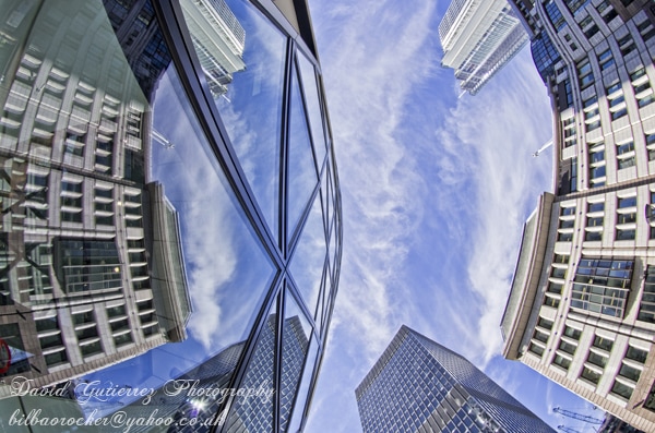
This is my favourite image as I like how he has used both modern and old contrasting buildings. I like the way he has used the old building in reflection of the newer glass one it is almost like he is showing us how architecture had developed but that we also have not forgotten about the old buildings also looks like it is trying to show old buildings are still just as much of importance than newer builds. Another reason this is my favourite image is because of the curved outlines of the building what also show contrast to one of the buildings which outlines are completely straight and parallel.
Working in similar style of photographer.


Editing in similar style of photographer.
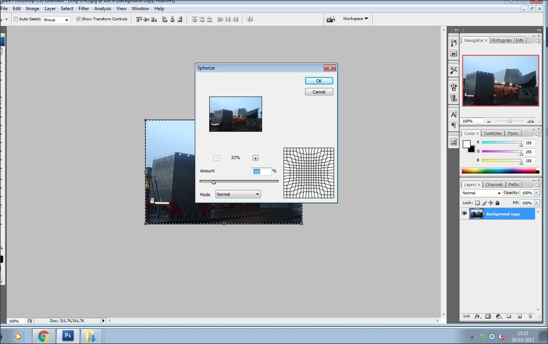
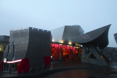
In my editing I have decided to go with a similar design to my favourite image of the photographer, so I have distorted my image with an app and what my edit did is it pulled my image towards to the centre of the circle which is present in my screen capture, this was just a practice in case I choose to distort my image in my exam

My edited photograph does not look nice... I’m sure the reason for this is that the building I chose to photograph did not have many straight lines, so it makes the curved lines look unrealistically distorted, to further edit my images in the style of my photographer I will be trying to boost the saturation of colours to give it a more dramatic look.
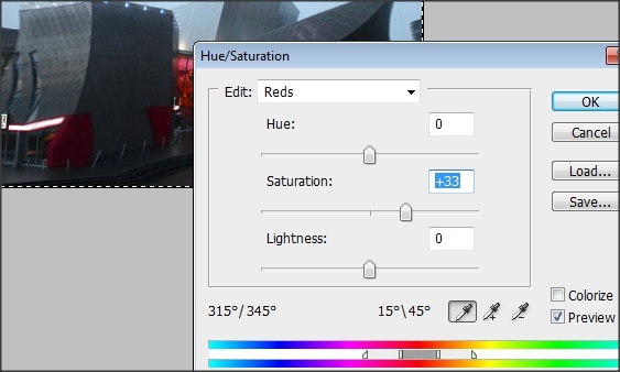
My test editing went very well, whilst editing I learned how to change the hue, saturation and learned how to adjust filters accordingly to my specific needs.
Margaret Stratton.
Margaret Stratton is an American photographer and video artist studied at the Evergreen State College in 1977 and the University of New Mexico in 1983-1985, Stratton explores the unwritten history of a place, the culture and its people…using the architecture, ruins, and religious settings to aid her in creating her image to write the history in an image. The images have a haunting, eerie feeling to them however interesting the contrasting effect of feelings draws the audience in.


Throughout my research I have noticed that she portrays the history that she is trying to show by combining old styled settings and something representing death. in many of her images she uses the bones of dead people this impacts her images and shows what that event in time caused to happen. She also always uses different shades to add an eerie past styled effect over the image this is showing that she is not celebrating a good positive memory but more sadistic forgotten about past events in the world. Her style of working is something I am not very comfortable with and the access to 'remains' isn't really possible however I could take images of forgotten about buildings so I can work in a similar style as the artist.
My favourite image.
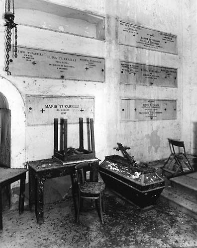
This is my favourite image as I like the way Margaret uses the upside down chair as a sort of arrow to make the audience look upwards and at the writing, however, from here the writing takes you to the right-sided of the image then from here you look at the coffin, these are caused as leading lines are implemented in a smart way so the audience doesn't know where to lay their eyes. Margaret used a monochrome filter to give it the black and white effect this was to help with the eerie effect she was trying to create, furthermore Margaret uses a chair and coffin side by side so the viewer can make a direct comparison between life and death. I also like the way the photographer has used the rule of thirds and used all cross sections as the chance for a leading line. Margaret would have used a fast shutter speed to make sure the image is crystal clear and set the camera at 0 exposure for the reason it wont be under or over exposed and a wide f-stop to get everything in the image.
Working in similar style of photographer.
mixture if my ones from Spain, town


Editing in similar style of photographer.
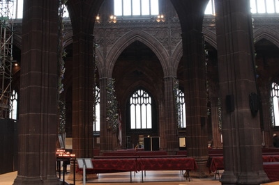
To edit in the same style as my photographer I set my camera into the monochrome setting to start with. I am now also going to adjust the levels in order to make the sky stand out; the reason I want this is because the cloudy skies give the impression that there is something more than what we can see what is happening. This gives a sense of mystery allowing the viewer to question them self’s of why this effect is being give off. The fact that you can see the graves at the bottom suggests it may be a deadly secret this church holds.

In my editing I changed the contrast of the black colour to emphasise the darkness of the church. This will help my audience question them self’s why this church is of such a dark nature, this makes them engage by using their imagination to what exactly the image is about. I think by doing this I’m working in a similar style as Margaret Stratton because she at no point exactly gives away what part of the history she was taking the image for and in fact her audience were making their own conclusions to what she meant by the images. I think this because me and my friend had a discussion about a few of her images and we both came up with totally different conclusions to what she was displaying.

Candida Höfer.
Candida Höfer who was born in 1944 is a German-based photographer and a former student of Bernard and Hilla Becher who also were photographers. Candida's work mainly focuses on places she feels are ignored by the people who see them, she implies that she makes "portraits of places". Portrait photography is usually used as a way to show importance of a person but in her 'version' she is trying to show the importance of a place. Her work is mainly known through her technical perfection.


Candida's images are created by using a high f stop such as 22 in order to make sure she gets depth and everything in focus in her image, however, to counter balance light intensity she would need a very fast shutter speed. she uses leading lines to draw the viewer to the furthest point of the image;this is why she uses such things like hallways and large long rooms with diagonal lines along the roofs. Candida also takes her image directly from the centre this is in order to make sure she can keep everything as symmetrical as possible, also it will help her be able to use the compositional rules as the skeleton body for her photographs to match up to the millimeter.

This is my favourite image as I like the way candida has used a large depth of field to show the grandness of the building, when I look at this image I represent it to wealth and someone who has a lot of money, this is because everything seems expensive and detailed. The photographer iuses a large depth of field to emphasise depth and size of these halls, the photographer also uses symmetry to show how symmetrically perfect these paces are; this gives. I like the way the photographer also has leading lines (produced by the design on the top sides of the hallway) to draw the reader to the centre of the image.
Working in similar style of photographer.(in school)


These were just test shoots so I could practice taking these types of images, by doing this I will be able to understand what type of camera settings will be more useful, I found that using the biggest F-stop allowed the image to all be in focus, this will be an important factor in taking my images outside of school.
Working in similar style of photographer.(out of school)


Editing in similar style of photographer.
Using my apple device I took images of a local shopping mall, to take the images I used the chrome setting (you can see all the settings in the first image) however my favourite images is The last image on my gallery I took this at Christmas time when all the Christmas decorations were up I did try recreate this image in my recent shoot but the mood of the image was a lot different as the decor is now down. I like this image the most as it has an amazing composition and an exquisite colour scheme, this image was edited using a standard filter on an apple device called 'home', this immediately boosts saturation of vibrant colours giving my images a very different warm feel however I have noticed that Candida’s images seem to be more like pastel colours therefore I will be using Photoshop to furthermore edit my favourite image and giving it a pastel like look.
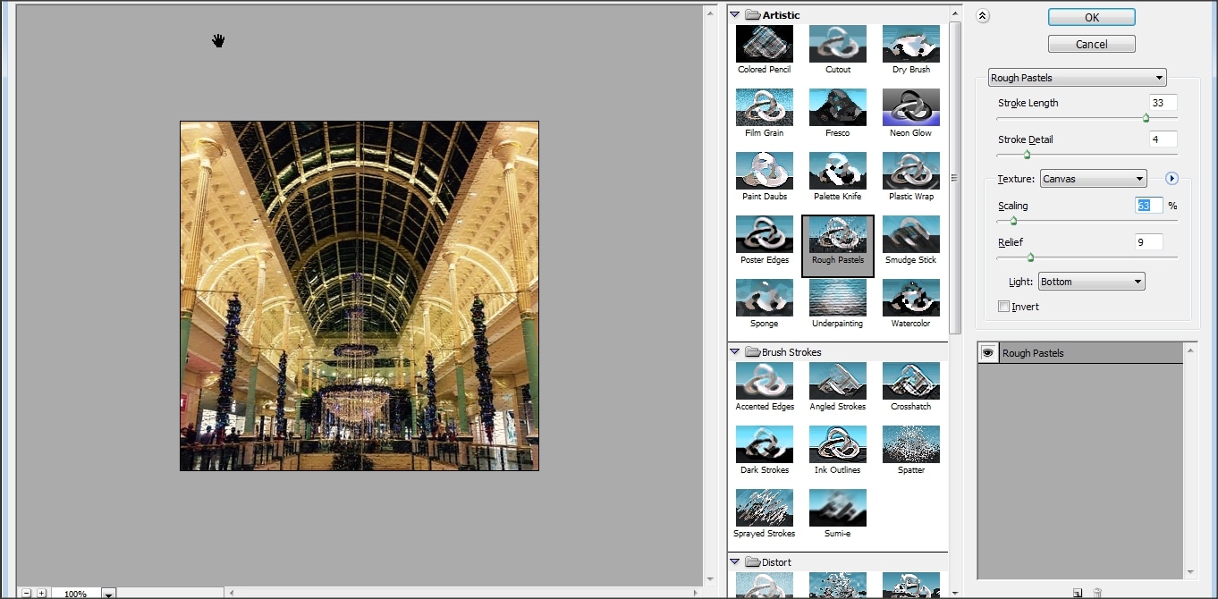
To add the pastel effect onto my image I have used Photoshop editing software and used a filter called rough pastels, at first I did not like the image as it took the sharpness of the image completely away therefore I adjusted the sliders to create a pastel like look without distorting my image so they are nor to sharp (to look like pastels) and nor too soft to lose all my quality of the image.
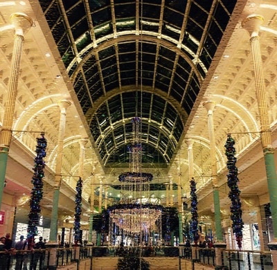
I do really like this image, this would be a good effect on modern buildings interior to bring out the grand feeling of it and the vibrant colours inside.
Berenice Abbott.
Berenice Abbott was a photographer who was part of the straight movement this was where they took un-manipulated images to show sharp detail in a scene, this allowed Berenice to show (in high detail) how New York City was changing with architecture in the 1930s and helps represent the atmosphere it is creating.


In all these images I can clearly see that no images are manipulated, this is to present exactly how it looks in real. All images in black and white (the reason is the old cameras he would only have access to). They also portray depth in New York representing it as a large place, most of the pictures are of high profile locations within New York.

This is by far my favorite image, this is because I like the way he has used the downfall of the cameras ability to the best of his ability, he has used the leading lines and the quality of the camera to make the bridge stand out in the distance without it being clear this is because the bridge contrasts with the buildings closer to the camera.
Final plan.
My final plan takes inspiration from Margaret Stratton’s thought process initially, this is because she looks deeper into things and the history behind event which are not told in any way shape or form. I have looked into one of the building I photographed-the imperial war museum in Manchester, it had an exquisite design so I decided to find out why it seemed so sharp and looks dangerous therefore I did some research and found out that the architect designed it with 3 shards each representing a different part in which war destroyed: land, air and earth.
In my editing I am going to try replicate a Normandy landing situation as this was a very important, key event in the war which helped the ally’s progress to take places such as France back from the Nazis occupation, this was the turning point in the war. I have chosen this especially as the architect had close relations with many Jews exterminated by Nazis… and if the Nazis kept control over key countries with a lot of power they could have or more than likely exterminated every un-Germanic race meaning the world would be a lot different today, I will furthermore show what the building is representing. I am hoping to base my image as if it was taken on the many boats deploying troops onto the Normandy beaches, I am also going to try add planes in the sky, search lights. I will however try create a glow over the war museum (each shard) in red to show how this museum holds many stories and some which are not physical items but even first-hand accounts expressed within the design.
If I finish my editing an am happy with my image I will try make a series of images reflecting on other wars also for example I could do a Vietnam war image, I would do this by using a famous image of the Vietnamese girl who was injured in a Napalm strike in the village of Trang Bang, South Vietnam, on June 8 1972 the image was taken by Nick Ut who got the world press photograph of the year from the image. I may move onto other wars such as Afghanistan, Iraq, 'Isis' and the most recent/ on-going the war in Syria.
The reason I have chosen to depict war in my image is to try and promote world peace by showing the museum represents the consequences of war. The museum doesn't just focus on the world wars , but wars from around the world and up to the present day. I will try to make my audience think about how they can make the world a better place themselves. Furthermore I am also choosing the museum in particular as a focus as it is the museum's 100th anniversary. I want to show that everything in the museum is for future generations to learn from and is ironically still taking place now. If my generation does not act soon we could soon have a world war three. This is an uncertain time as growing up and for my generation as we don't know what to expect, We feel unsettled by what the world leaders are doing at the moment.
10 Hour Exam
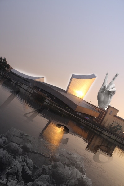
World War 2- first version.
Editing a Normandy landing craft


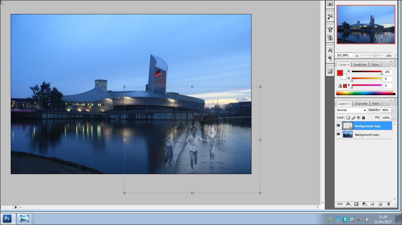
In the first part of my editing I used the magic selection wand tool on Photoshop to delete the unwanted background on the image (images 1,2) after that I then went on to the hue and saturation adjustment tool to make the image slightly more lighter but more saturised to bring out the darker colours of the boat and soldiers uniforms (images 3,4).
Separating the 'sky' and 'building' layer in order to add a glow


In this selection of images I selected the outline of the museum with a magnetic lasso tool, this was in order to create a diving barrier between the sky and the museum (you can see the barrier in image 3; the white dotted line) using this I separated the image into 2 different layers one being the sky and the building to the right of the museum and another the museum its self. in between images 1 and 2 i used a paint brush tool on a low 'hardness' setting to go around the edges of the museum to give it a glow effect. I did it this way as using the default Photoshop glow effect gave it many flaws such as overlapping my image. After I had finished with the paint brush tool I made my sky visible again (image 3) I did not like how bright the red was therefore I changed the RGB levels to give it a more subtle effect(image 4) and the last image shows what it was like at the end of this stage of editing.
Further editing of boat (distorting)

As the landing craft and soldiers were in the water I thought that I should also give it a water'esc like distortion, this was because I wanted to create the effect of peacefulness and to represent how all these soldiers life’s were washed away by the war. I also implemented this as I learnt from my research that Margaret Stratton liked to implement things into her images what show a story but not tell it.
Adding German war bombers to the mix. (enemy)


In this piece of editing I had previously saved an image of a German fleet of aircraft bombing British cities, in the first editing image, I placed the image where I wanted the planes to be to be. In the second, third and fourth image I used a mixture of the blending and dissolving tool to help get rid of the background of the image. The dissolve tool helped me pick up the lighter colours and deleted them automatically, however, I then had the problem of keeping the bombs so I used the dissolve tool in an inverted way to bring back the falling bombs. On image five and six I was showing how much better it was when I turned the opacity down, this made sure the composition was still on the building and not the planes. It also gave it a subtle soft look furthermore giving that peaceful atmosphere which is juxtaposition as war and peace are complete opposites.
Small extra touches


Image 1 - I feathered my image using a small radius to give my glow a more subtle effect.
Image 2 and 3 - In images 2 and 3 I was becoming indecisive whether to have the planes and kept turning them on and off to see which was best, in the end I kept the layer in case I wanted to implement it further down the line. in image 3 I used the hue and saturation to adjust the lightness of my 'glow’ I put it at +100 as I really liked the white glow effect ass these seemed more peaceful and gave an overall calmer mood to my image as opposed to the red which gave an angry mood to my image.
Image 2 and 3 - In images 2 and 3 I was becoming indecisive whether to have the planes and kept turning them on and off to see which was best, in the end I kept the layer in case I wanted to implement it further down the line. in image 3 I used the hue and saturation to adjust the lightness of my 'glow’ I put it at +100 as I really liked the white glow effect ass these seemed more peaceful and gave an overall calmer mood to my image as opposed to the red which gave an angry mood to my image.
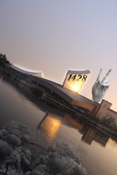
Adding numbers


In image one I screenshotted my image because I was using it to help me get the numbers into images so I could use them to develop into layers with different numbers, these different numbers in the order of 1,428 represents the amount of people killed in a 10 mile radius of my home the reason I selected this part of the war was because it is something personal to me; my great grandma on my mother’s side who was killed when Strangeways prison gates fell on her during a night raid on the city. The reason I chose to implement my personal ideas was because the museum its self was built by a member of a Jewish family who were killed by Nazis.
At this point I saved in order for my second version of my WW2 editing to be continued from this point.
At this point I saved in order for my second version of my WW2 editing to be continued from this point.
Further editing of my numbers


I used my rubber tool on a low 'hardness' to give it a faded look this will also help give the subtle like look I have been trying to achieve throughout my image.
Editing my perspective.


I edited my perspective using the skew tool, I skewed the top of my images smaller than my bottom this makes my numbers look like the have depth and are floating, part of my idea of this come from an image I saw with bodies of the Normandy day landings floating.
Finished piece
World War 2- second version.


I have started from where I implemented the italics in the editing previous.
Image 1 - In my first image I have started to resize my numbers
Image 2 and 3 - I am/have placed my numbers in the desired location.
Image 4 - I merged my layers so all the numbers are in the same layer, this will make it easier to edit.
Image 1 - In my first image I have started to resize my numbers
Image 2 and 3 - I am/have placed my numbers in the desired location.
Image 4 - I merged my layers so all the numbers are in the same layer, this will make it easier to edit.
further editing my numbers.


To give my numbers a more blended in look (in the sunlight) I used an eraser with barley any 'hardness’ in order for the black to fade in the further the part gets from the sunlight. I also moved the numbers to the correct order. In the third image I make it slightly smaller, changed the opacity and lower the perspective this is to create a more polished look and show a variety in my image.


Final gallery of images.


Evaluation.
Throughout all my images a common theme flows, war, all my images are about war. The main inspiration for my manipulating comes from Margaret Stratton’s ideology that the images should not always tell a story but make the audience of the image create their own story’s through the visual, limited, information given, For example before I added a peace symbol I used colours, such as white I also made my numbers and landing craft look like it was in the water, this helps me present a calm and peaceful atmosphere to my audience, I also made a few different versions of the same image by adjusting the image and using sliders and inverting of colours to create my own filters, these give of different effects, the black and white image represents bleakness and a dark gloomy atmosphere, the inverted colours make the image have a very lively ,mood and almost excite the audience however the standard images portray a clear message, peace not war because it causes destruction.
